Geared Slab Serif Font
Geared is a condensed Slab Serif font offered in four distinct weights: Thin, Regular, Bold, and Extrabold. This industrial-inspired typeface...
Hand-picked free fonts for designer and developers, constantly updated.
Geared is a condensed Slab Serif font offered in four distinct weights: Thin, Regular, Bold, and Extrabold. This industrial-inspired typeface...
Masifa Rounded is a font inspired by the renowned artist Piet Mondrian, known for his significant contributions to the De...
Masifa Rounded is a versatile sans-serif font that effortlessly blends edginess with softness, resulting in an elegantly strong appearance. It...
MyCreativeLand presents a sophisticated serif typeface that exudes contemporary charm and a relaxed demeanor, perfectly suited to elevate your design...
Synthview has crafted a remarkable typeface known as Operetta, a sleek and condensed sans serif font family that draws inspiration...
Obvia is a modern geometric sans-serif font family developed by Typefolio, characterized by its crisp and soft shapes. The design...
Hakuna Font is a striking sans-serif typeface with bold, sharp-tipped characters, making it ideal for a wide range of projects....
Introducing Ryker, a modern and elegant typeface designed by HeadFirst. This font offers a unique blend of distinctive forms, ensuring...
Introducing the captivating and meticulously crafted script font, Crustaceans Signature Font. This handmade typeface is designed to make a bold...
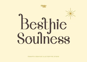
Introducing Besthie Soulness, an exquisite serif font that effortlessly blends luxury, classic, and modern aesthetics, enriched with an extensive array...
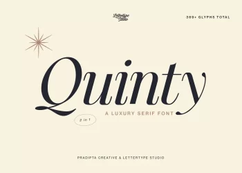
Introducing Quinty, a luxurious serif font exuding classic charm, boasting a comprehensive set of 389 meticulously crafted glyphs. The inspiration...
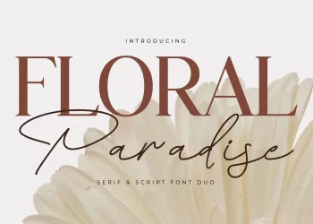
Step into the enchanting world of design with Floral Paradise, a captivating serif and script font duo that boasts a...